Documentation / Customizing Buttons
Customizing Buttons
Primary Button
The Primary Button panel controls the main action button on the login form — typically the Log In, Register, or Get New Password button.
Accessing Primary Button Settings
- Navigate to Settings → Login Customizer.
- Open the Login form button (primary) panel in the Design tab.
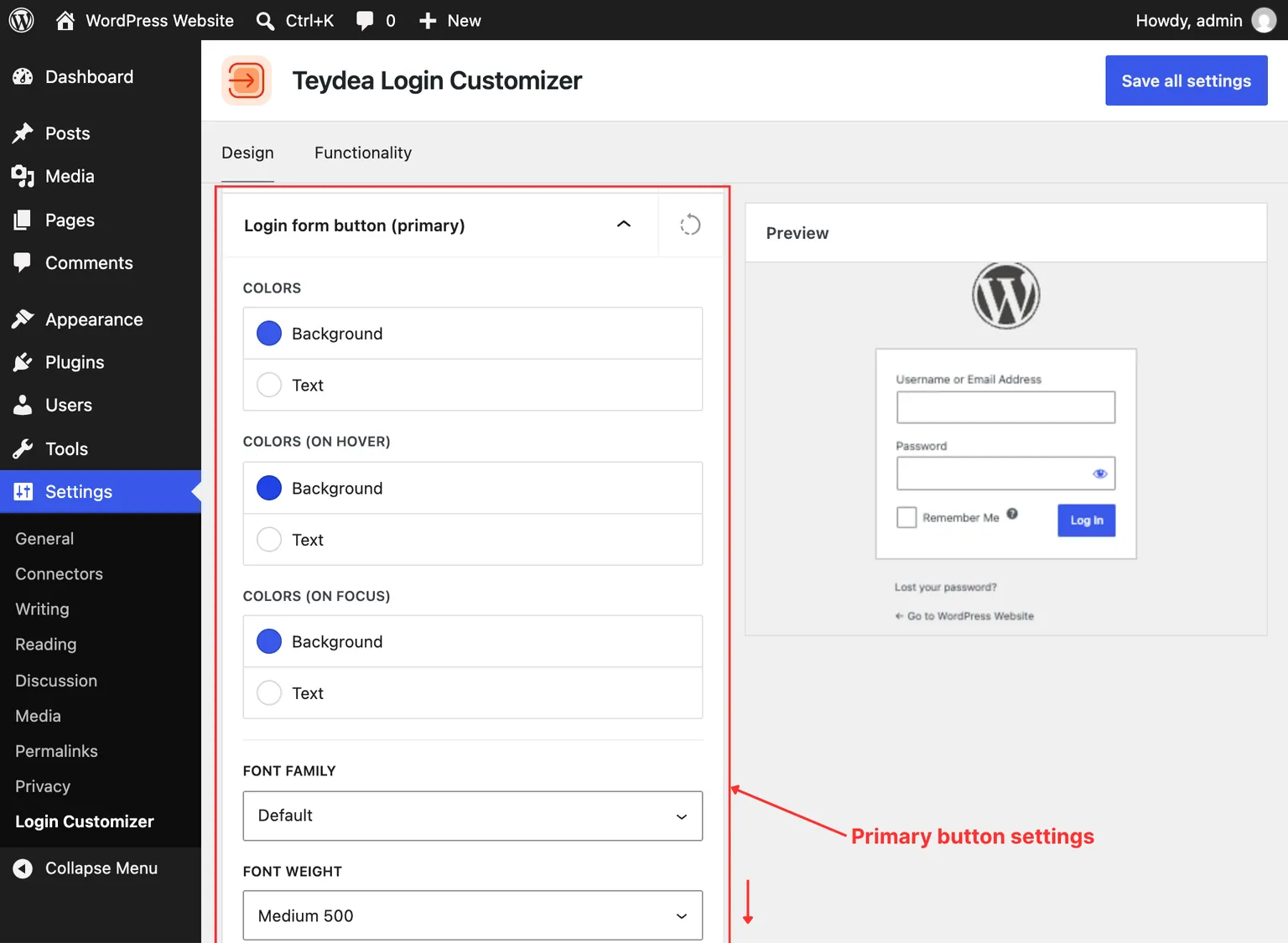
Colors
The primary button has three visual states, each with independent color settings:
- Normal — Background color, text color, and border color in the default state.
- Hover — Colors when the user hovers the cursor over the button.
- Focus — Colors when the button has keyboard focus.
Typography
- Font family — Choose from available theme fonts.
- Font size — Set the button text size (default:
13px). - Font weight — Control text boldness.
- Letter case — Transform text to uppercase, lowercase, capitalize, or none.
- Line height — Adjust the vertical spacing of text within the button.
Width and Alignment
- Width — Choose between Fit content (button width matches its text) or 100% (button spans the full width of the form).
- Alignment — Position the button: default (inline with the Remember Me checkbox), or on a new line aligned left, center, or right.
Border and Shadow
Configure the border width, style, color, and radius for each side of the button across normal, hover, and focus states. Box shadow values are also available for each state.
Button Labels
Customize the text displayed on the button for each login page screen. Labels support per-language text:
- Log In — The label on the main login screen.
- Register — The label on the registration screen.
- Get New Password — The label on the password reset screen.
- Save Password — The label on the password save screen.
Secondary Button
The Secondary Button panel controls buttons that appear alongside the primary button, such as the Generate Password and Change buttons on the password reset screen.
Accessing Secondary Button Settings
Open the Login form button (secondary) panel in the Design tab.
The secondary button offers the same customization options as the primary button: colors for normal/hover/focus states, typography, width and alignment, border, shadow, and per-language labels. The secondary button labels include:
- Generate Password
- Change