Documentation / Customizing Labels and Input Fields
Customizing Labels and Input Fields
Labels
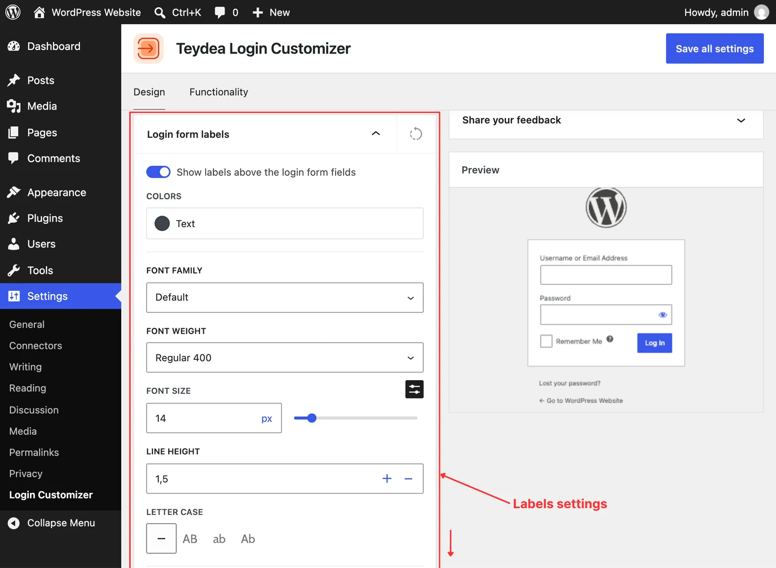
The Labels panel controls the text that appears above each form field (e.g., “Username or Email Address”, “Password”).
Accessing Label Settings
- Navigate to Settings → Login Customizer.
- Open the Login form labels panel in the Design tab.
Visibility
Toggle the Show switch to hide form labels entirely. When labels are hidden, consider setting placeholder text on input fields so users still know what to type in each field.
Typography
- Font family — Choose from fonts available in your theme’s configuration.
- Font size — Set the label text size (default:
14px). - Font weight — Control the boldness of label text (100 to 900, with italic variants).
- Letter case — Transform label text to uppercase, lowercase, capitalize, or none.
- Line height — Set the spacing between lines (default:
1.5). - Text color — Choose the label text color.
Spacing
Adjust the margin and padding around each label using the individual top, right, bottom, and left fields.
Custom Label Text
Each label field supports per-language customization. If your site has multiple languages installed, you can set different label text for each language. The fields include:
- Username
- Password
- Username or Email Address
Input Fields
The Input Fields panel controls the appearance of text input fields on the login form.
Accessing Input Field Settings
Open the Login form input fields panel in the Design tab.
Colors and Borders
Input fields support three states with independent styling:
- Normal — The default appearance of the field.
- Hover — Appearance when the user hovers over the field.
- Focus — Appearance when the field is active and receiving input.
For each state, you can set:
- Background color
- Text color
- Border width, style, color (each side independently)
- Box shadow
Input Typography
Configure the font family, font size, font weight, and line height for text entered in the input fields. The default font size is 24px.
Placeholder Text
Set custom placeholder text that appears inside empty input fields. Placeholder text supports per-language customization. Available placeholder fields include:
- Username
- Password
- Username or Email Address
Password Eye Icon
Customize the color of the password visibility toggle icon for normal, hover, and focus states.
Border Radius
Round the corners of input fields by adjusting the border radius for each corner independently.